Eternal Mametchi Fan
Well-known member
A lot of people think Mametchi was "redesigned" on the Version 3 and given a big head, cartoony eyes ,and changed to blue instead of yellow. But this was not true. Mametchi's overall design was never majorly changed.
Just look at images of him on Japanese merchandise from 1996 and 1997.


And his sprite on the Tamagotchi 1997 Gameboy game:

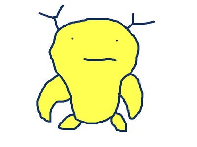
Yes, he looked fat with tiny eyes on some figures and stuff:

But that is just to imitate the sprite, as NO OFFICIAL ARTWORK depicts Mametchi as being fat with dot eyes EXCEPT the US artwork of him, which, again, is based on the sprite and because it came AFTER the Japanese art, it should not be deemed as Mametchi's first look. Mametchi was NEVER blue in Japan. I once wrote a fanfiction with vintage Mametchi in it and I mentioned he was yellow; someone complained about my story being bad just because I should have made him blue. I was going by the JAPANESE original Mametchi, not the American one.
Now, how are these two that much different?

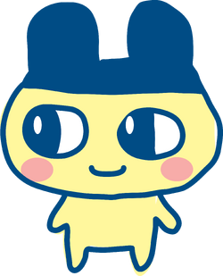
The art style was just changed. Added highlights to be more realistic, blushing cheeks, and less sloppy lineart.
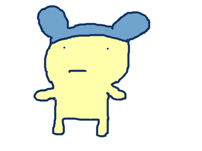
Now, the reason Mametchi looks fat with dot eyes on the P1 is because the sprite is bad and inaccurate. They changed Mametchi's sprite not because they changed the character's design, but to IMPROVE it and make it look more like the real Mametchi.
Look at the difference between Pipotchi and HER sprite!

And last of all, Young Mametchi's sprite looks very similar to original Mametchi's but it is inaccurate (his head is too small).


So, I find it ironic about Mametchi's look being "changed" and how "bad" the new look is. No, the sprite was just fixed. What were they supposed to do? Change his official art to look like the inaccurate sprite and forget about all the merchandise that depicted him with his big eyes and large head?
That's the end of this little explanation
Just look at images of him on Japanese merchandise from 1996 and 1997.
And his sprite on the Tamagotchi 1997 Gameboy game:
Yes, he looked fat with tiny eyes on some figures and stuff:
But that is just to imitate the sprite, as NO OFFICIAL ARTWORK depicts Mametchi as being fat with dot eyes EXCEPT the US artwork of him, which, again, is based on the sprite and because it came AFTER the Japanese art, it should not be deemed as Mametchi's first look. Mametchi was NEVER blue in Japan. I once wrote a fanfiction with vintage Mametchi in it and I mentioned he was yellow; someone complained about my story being bad just because I should have made him blue. I was going by the JAPANESE original Mametchi, not the American one.
Now, how are these two that much different?
The art style was just changed. Added highlights to be more realistic, blushing cheeks, and less sloppy lineart.
Now, the reason Mametchi looks fat with dot eyes on the P1 is because the sprite is bad and inaccurate. They changed Mametchi's sprite not because they changed the character's design, but to IMPROVE it and make it look more like the real Mametchi.
Look at the difference between Pipotchi and HER sprite!
And last of all, Young Mametchi's sprite looks very similar to original Mametchi's but it is inaccurate (his head is too small).
So, I find it ironic about Mametchi's look being "changed" and how "bad" the new look is. No, the sprite was just fixed. What were they supposed to do? Change his official art to look like the inaccurate sprite and forget about all the merchandise that depicted him with his big eyes and large head?
That's the end of this little explanation